2023
Economist Impact
Data visualisation and Web Development

- React
- Next.js
- D3.js
We have worked with the Economist Impact team for over two years. During this time, we collaborated closely with their designers and project managers to develop a series of websites that contain rich data visualisation pieces.
Those websites help researchers, journalists and the general public to access data and insights in a engaging and user friendly manner.
Global Food Security Index, The City Water Index, Infrastructure for Good and The Innovation Quotient are some of the highlights of our work with the Economist Impact.
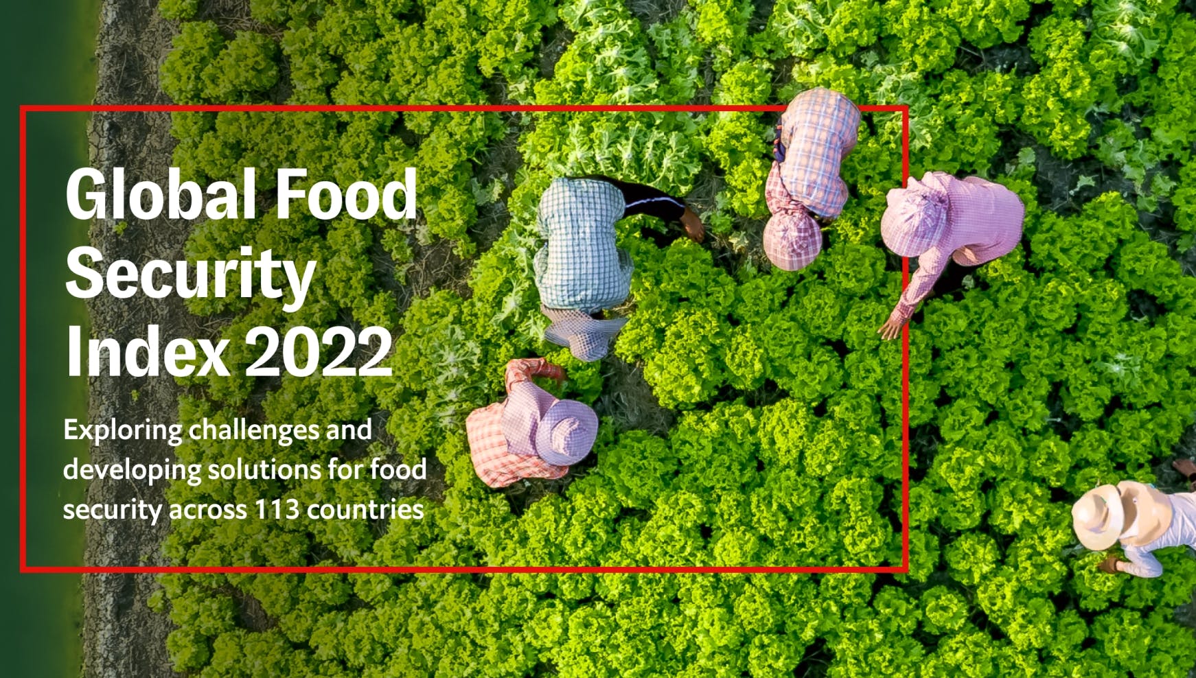
Global Food Security Index
Process
Solid Foundations
One the first things we did was to create a structure for ingesting and manipulating data from the research teams. Together with the Economist Impact technical team, we worked on a template that was then used to develop all the index websites going forward.
We also developed a series of reusable React and D3.js components to be used across multiple projects. This would help speed up the development of future projects so we could put a bigger focus on creating more interesting and visually rich experiences.
The design team presented us with increasingly complex visualisations and designs; but our work on creating a solid base allowed us to take these on and deliver every single time.
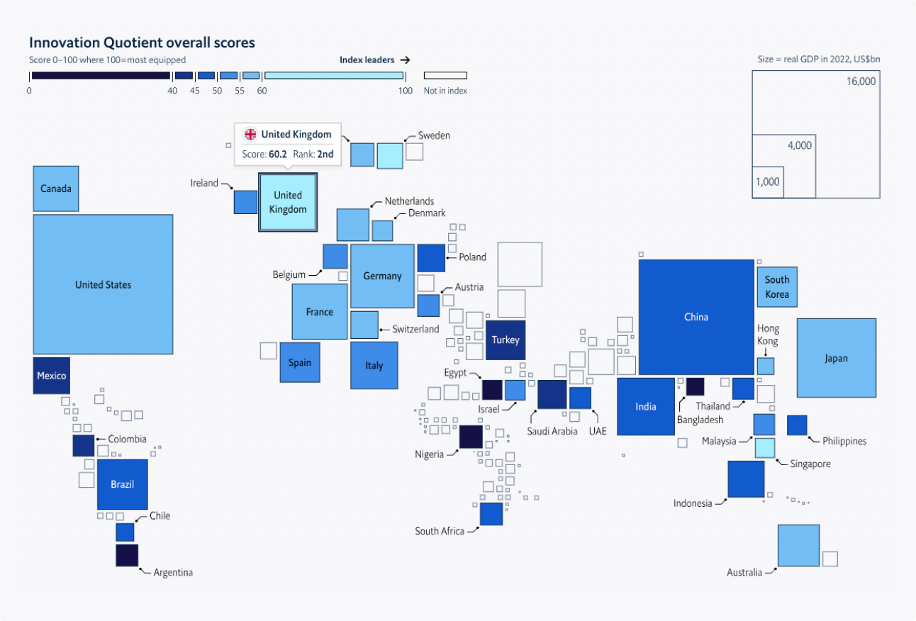
We built a series of interactive world maps that help visualise the different indexes. These were built using a mix of D3.js, topojson and static SVG maps.
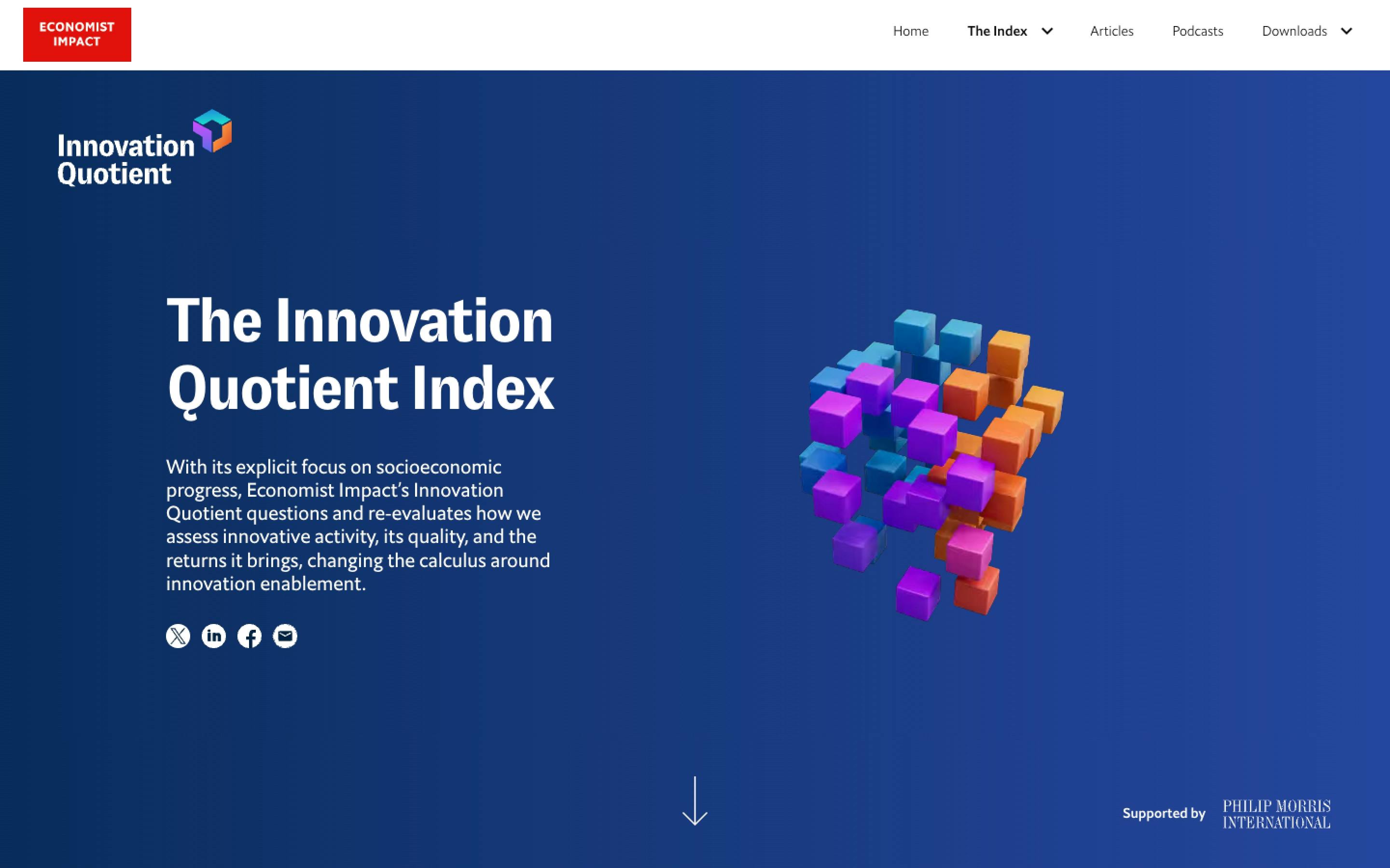
The Innovation Quotient Index
"We’ve worked together on quite a few projects now, and I’m always relieved to hear when Studio 206 are working with us on our next big thing. Our bespoke designs often feature original and unconventional ideas, but I always feel this team relish the challenge and continuously exceed our expectations."
Ben Willers
Senior Information Designer at Economist Impact
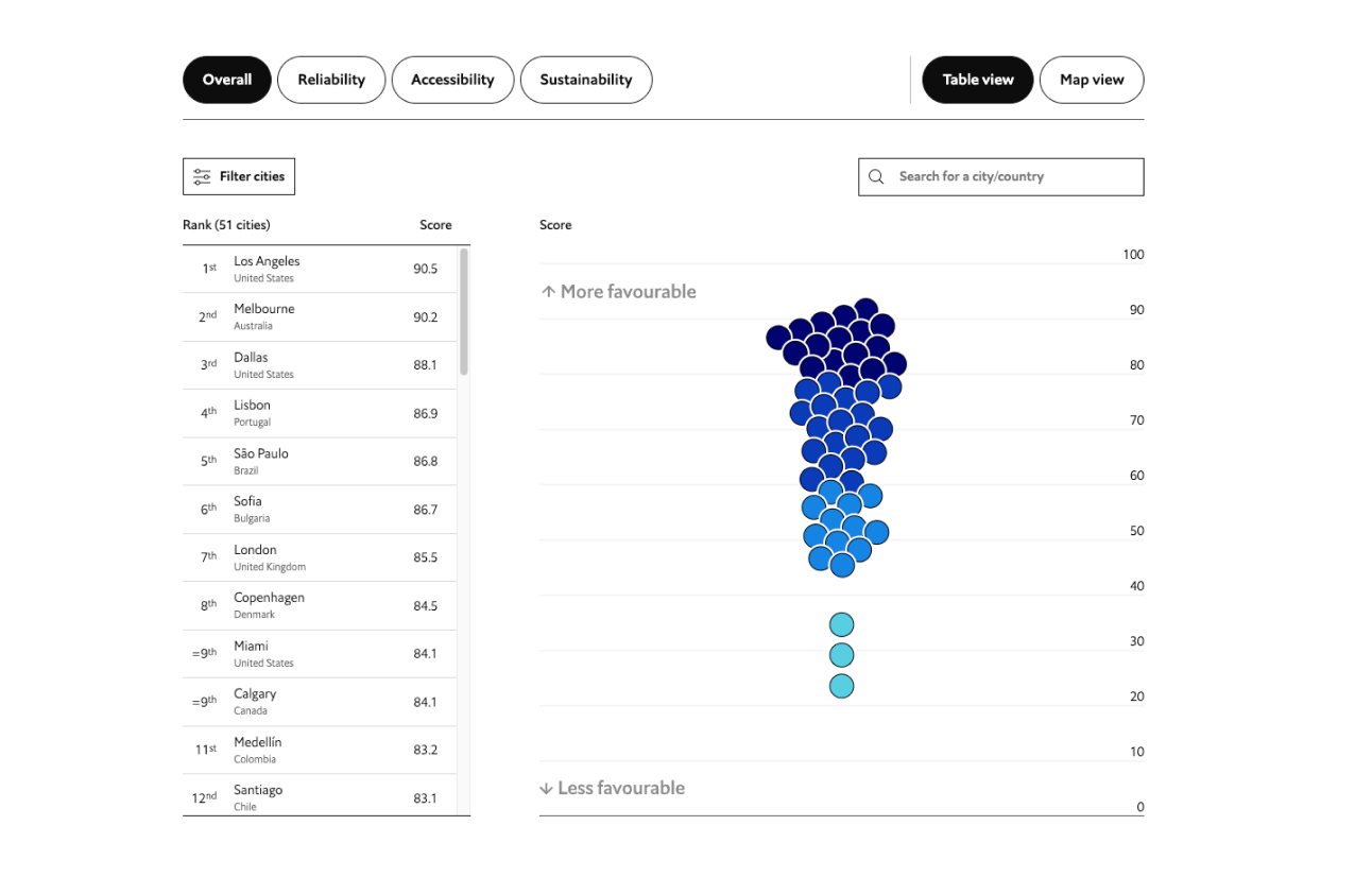
The indexes contain different indicators and sub indicators for each country. To help navigate a large amount of data we built various interactive charts and a filtering system.
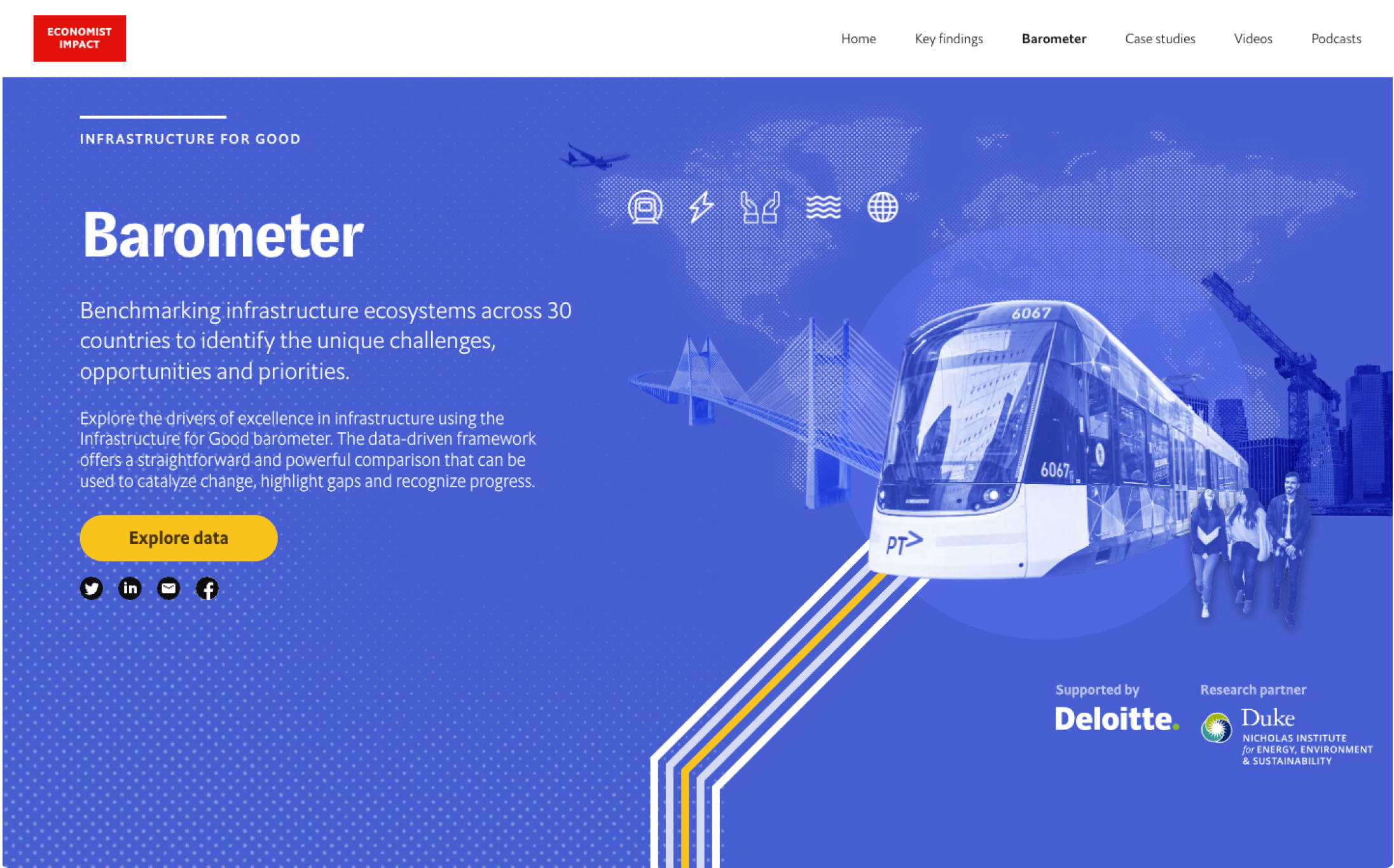
Infrastructure for Good